Hunt
Tuesday, 26 April 2011
Monday, 25 April 2011
Alterations to previous images.
This image I added a photoshop artistic filter on the image which had been flattened so that it effects all of the layers, the filter makes its look like brush strokes however I modified it so it would make it feature heavy contrast in certain areas and defining lines in certain areas of prominence such as the glare from the sun which draws attention and it has radial lines around.
Personally I think it helps it all blend together also as the previous version had a sort of desaturating layer on top which was negated when the filter was applied.
Image 2
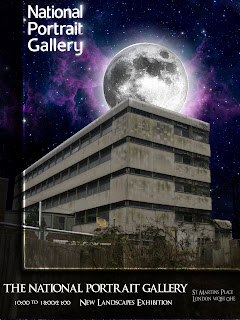
Here is another image which was drastically changed firstly part of the building was cut off only because the tree didn't go well with the new darker background as it had pixelated white spots which didn't show up with the previous light background as they blended.
The reason why I changed the background is because I felt it was too flat and didn't look all that impressive and slightly unrealistic as it just looks plain.
So I used this image below as the background however it was not big enough as I wanted the focal point of the nebular which spirals inwards to be around the moon to add a mystical elemental look to it, so to make it look bigger and still fit around the moon I painted and copied and pasted sections to create a bigger background and made sure they blended almost perfectly.
Alternate outcome - Leaflets
Wednesday, 16 March 2011
Evaluation
I enjoyed making the leaflet/postcards in this way as it is something I have never tried before, I really liked the typography I used such as on the first page where the figure flies it says 'WOOSH' which is exaggerated and bended upwards to mimic the movement of flying up into the sky, That I feel fills out the image and makes it feel more like the comic book style which I was looking for. Using Cristiano Siqueira's style to give the effect of smoke and special powers on the character was good however I should have spent more time on it as it could look much better. Also concerning the figure I could have taken photographs of people and used them instead of drawing them, I used a photograph of myself for the second page which I darkened almost entirely to black and it looked good, on the other hand the last page the character looks a bit obvious that its a drawing and sticks out from the rest of the image however the rest looks good, including the of set panels of him flying on page 1 and him being angry on the last page.
If I was to improve on it I would do more pages and incorporate images of myself or others that I have photographed and more variety in locations.
In all I am pleased with the background images(the surreal landscapes which is sort of a play on the new exhibition which is called landscapes and mine are featured in the background of all pages which helps relate it.)
Tuesday, 15 March 2011
Backgrounds for final solutions
Subscribe to:
Posts (Atom)


